App Store Optimization for Indie Apps
A practical app store optimization workflow for indie apps: choose search terms, improve each store page, test creative, and measure real installs.
An app can work beautifully and still be hard to find. The store page is where that invisibility becomes measurable: a person either sees a relevant result, understands the promise, and installs, or moves on.
App store optimization for an indie app means improving discovery and installation. Choose searches your app genuinely answers, put those concepts in the right fields for each store, make the page persuasive, and measure the path from impression to install.
The mistake is treating ASO as a keyword exercise. A phrase that brings the wrong visitors can make a ranking chart look lively while downloads stay still.
Start with the user's intent, not a list of popular words. Then change one part of the page at a time and judge it by the action you need.
App store optimization starts with two separate scores
A useful ASO review asks two questions. Can the right person find the listing? Once there, do they install?
Those are related, but not the same problem. More visibility with weak conversion usually points to a mismatch between the search and the page. Strong conversion with little visibility suggests the page may be convincing, but the app is not entering enough relevant searches.
Apple's App Store search guidance, accessed November 2, 2026, says search considers text relevance, including the app name, subtitle, keywords, and primary category, alongside user behavior such as downloads, ratings, and reviews. Google's App Discovery and Ranking guidance, accessed the same date, says its systems consider the app's supplied information and characteristics, plus user feedback and engagement. Neither platform publishes a simple formula you can fill in to guarantee a position.
That uncertainty is not permission to guess. It is a reason to isolate the part you can observe.
Open App Store Connect or Play Console. Write down the baseline before editing anything. For each store, record the date range, search impressions or listing visitors, product-page views if available, installs, and the displayed conversion measure. Keep the source and country filters consistent in later comparisons.
Then sort the problem:
- Few relevant views: investigate search coverage, metadata, category fit, or country targeting.
- Views without page visits: check whether the title, icon, and result preview match the query.
- Page visits without installs: inspect the first screenshots, paywall expectations, and recent review themes.
Do not compare a filtered search segment this week with all-store traffic last week. That is not a before-and-after test. It is two different groups wearing the same chart label.
Your working measure is not a universal industry benchmark. It is the app's own baseline, compared with the same source and audience after a deliberate change.
Choose keywords from real user problems
The useful keyword is not necessarily the biggest phrase in a tool. It is the phrase that describes a task your app completes, in language a likely user would type.
Start with evidence you already own. Read support tickets, onboarding answers, review text, sales conversations, and questions people ask before trying the app. Pull out phrases that describe the job, the audience, the situation, or the alternative they want to replace. Keep the exact wording in a scratch sheet.

Next, inspect the store results for each phrase in the country and language you care about. Note the apps that appear, how their names and previews describe the job, and whether the results match your product. A term is a poor target if its visible results serve a different user, even if a third-party tool assigns it an attractive volume.
Score each candidate with a small worksheet. Give it a low, medium, or high mark for relevance, evidence of demand, and realistic competition. Relevance is a gate, not a negotiable score: if your app does not solve the searched problem, reject the term. For the remaining terms, prioritize clear intent and a result page where your specific product has a credible reason to be chosen.
Use this quick process today:
- Collect twenty phrases from customer language and store suggestions.
- Remove every phrase the app cannot honestly support.
- Group near-duplicates by one user job, rather than creating a separate target for every wording variation.
- Check the live results for the remaining groups in your main market.
- Pick one primary job and supporting concepts for the first metadata revision.
Treat keyword tools as estimates, especially when an app has little history. A volume estimate is not a promise of impressions. A rank tracker is not install attribution. Keep those figures in a research column, not in a forecast you present as a result.
The failure mode is choosing broad words because they look ambitious. A generic term can attract people who want a different feature. It can create a poor install rate and give you no clear lesson about your actual audience.
For a launch that needs a broader sequence than store metadata, use the startup launch checklist to keep the store page alongside the other launch work. The keyword sheet still needs to remain specific to the app.
Put the same product into each store's different fields
Apple and Google do not offer identical metadata surfaces. Do not paste one block of copy into both consoles and call the job finished.
Apple identifies the app name, subtitle, keywords, and primary category as text relevance signals. It also describes how screenshots and other product-page elements appear to people evaluating a result. Google Play likewise evaluates listing information. Google's Store listing experiments guide, accessed November 2, 2026, describes testing listing text and graphics to learn which options work for users. Check each console's current field rules before submission. Do not trust an old character-limit table copied from a blog post.
Give every field one job. The title should identify the product and, where it reads naturally, its main use. The subtitle or short summary should clarify the benefit or audience rather than repeat the title. Longer descriptions should explain what the app does in a sequence a new user can follow. Use category and keyword fields only for accurate, relevant terms.
Try this editing pass:
- Write one plain sentence: “This app helps [specific person] do [specific task] without [specific obstacle].”
- Compare that sentence with the app name and subtitle. The name identifies; the supporting field adds meaning.
- Read the listing aloud without the screenshots. If a stranger cannot say what the app does, simplify the copy before adding search phrases.
- Check every claim against the live product. Remove features that are planned or conditional unless you label that clearly.
- Preview the page in the relevant language and device layout before you submit it.
The platforms' explanations of ranking differ in detail. They do not expose a complete weighting system. Advice such as “repeat this term a fixed number of times” is not a safe operating rule. Write naturally for the store field, keep the phrase relevant, and use the store's search and acquisition reports to see whether the edit changed anything.
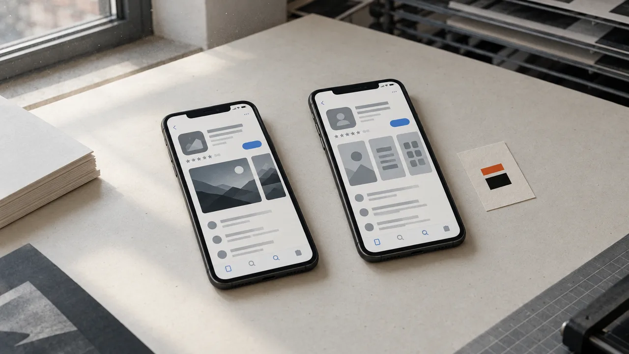
If the app serves distinct jobs, do not cram every audience into one sentence. Keep the default page focused on the broadest real use. Consider a tailored product page only when you have a matching campaign, feature, or audience and a way to measure it.
Make the first screenshots answer the install question
A screenshot is not a tour of your interface. It is evidence for the promise that earned the page visit.
Put the user's outcome first. A person considering a budgeting app wants to see how it makes a budget easier to use, not a settings screen with a dozen toggles. Someone choosing a language app wants to understand the practice experience, not a decorative splash screen.
Apple's product-page guidance, accessed November 2, 2026, says screenshots can show the app experience and appear in search results. Apple's product-page guidance also offers ways to test alternate creative, but that is a platform capability, not evidence that any particular design will win.
Make a short storyboard before opening a design file:
- First frame: name the user's problem or desired outcome in a few legible words.
- Next frame: show the feature that produces that outcome in the actual product.
- Following frame: demonstrate the next step, so the viewer can picture using it.
- Later frames: answer the strongest objections, such as setup effort or compatibility, only when the app supports those claims.
Use a real screen capture where possible. If you add a headline to an image, make sure it remains readable at the size and crop used by the store. Check that the first screenshot tells the story on a small device, where tiny copy becomes an expensive form of wallpaper.
Do not claim “best,” “fastest,” or “free” unless the statement is accurate and allowed under the store's current metadata rules. Avoid showing a feature that a new user cannot reach after installation. The screenshot can earn a tap. It cannot repair a broken first session.
A useful creative test changes one idea at a time. If the current first image focuses on a dashboard and the alternative focuses on the outcome, keep the rest of the page stable. If you change the icon, screenshots, title, and price at once, even a better result will not tell you why it improved.

Before you publish, show the sequence to five people who resemble the intended user. Give them a few seconds. Ask what the app does and which screen made them most confident. If their answers conflict with your promise, revise the sequence before you spend time polishing it.
Treat ratings and reviews as product feedback, not a trick
Ratings matter to the person deciding whether to install. They also tell you where the experience is creating friction.
Apple says ratings and reviews can influence App Store search. Google describes user feedback as one part of discovery and ranking. Neither statement supports buying reviews, gating a positive rating request, or pressuring a user to change a negative one. Ask for feedback after the user has experienced the value, and make support easy to reach before a complaint becomes a public review.
Open the latest reviews in each store and group them by cause: onboarding confusion, missing functionality, crashes, billing surprise, or a request for an explanation. Count themes over a fixed period, not just the stars. If several people mention the same failure, route it to the person who can fix it and record the release that addresses it.

A practical weekly routine:
- Read new low-rated reviews and a sample of positive reviews.
- Copy recurring phrases into a “user words” sheet, with the date and store.
- Tag each phrase as a product defect, expectation mismatch, or feature request.
- Respond where a factual public answer helps. Do not promise a release date you cannot meet.
- After a fix ships, check whether the same complaint continues.
The distinction between expectation mismatch and product defect matters. If people expected a feature because your screenshot implied it, change the page. If the feature exists but breaks, fix the product before rewriting the copy. A prettier promise can make the second problem worse.
Do not ask every user for a rating on first launch. That interrupts the moment before they have a reason to care. Choose a point after a completed useful action, and make sure the app's flow complies with each store's current review-prompt requirements.
Run one listing test with a decision written down
A/B testing is useful only when you know what choice the result will settle. “Try some screenshots” is a task. “Test whether an outcome-led first screenshot increases installs from this audience” is a question.
Apple's Product Page Optimization guidance, accessed November 2, 2026, explains the native test process and advises waiting until a treatment is declared better or worse than the baseline with at least 90% confidence before applying it. Google's Store listing experiments guide describes comparing listing variants. Use the decision criteria shown in the relevant console rather than treating a small early lead as proof.
Before starting, write four lines in the experiment note:
- Question: What single user-facing choice are you comparing?
- Audience: Which country, language, traffic source, or listing does the test cover?
- Primary measure: Which store-reported action decides the result?
- Next move: What will you change if version A wins, version B wins, or the result stays unclear?
Keep the baseline available. Do not end a test early because one variant is ahead after a small initial sample. Follow the platform's completion and confidence indicators, then record the outcome and the next hypothesis. If the audience is too small to produce a decisive result, keep the current version and collect more data rather than naming a winner by instinct.
A worked example makes the distinction clear. Suppose a hypothetical test has 200 relevant page views and 10 installs in the baseline, then 200 comparable views and 12 installs in the variant. The observed rates are 5% and 6%. That two-install difference is a signal to inspect, not proof that the variant is better. The example is arithmetic, not a benchmark or expected result.
Avoid testing two concepts in the same variant. A new screenshot plus a new title might improve the page, but the test cannot tell you which change did the work. Test the first screenshot first if that is your current bottleneck. Keep the title and other assets steady.
Localize only when the product and evidence are local
Translating a store page is not the same as localizing it. The right term, example, screenshot, and feature emphasis can change by market.
Start with the places that already show credible demand or where the app genuinely works well. In the console, compare visibility and installs by country and language. Inspect the store results in that locale, ask a fluent speaker to review the wording, and check that the screenshots show a product experience available to those users.
Do not translate a weak page into several languages and assume reach will appear. That multiplies maintenance without proving fit. Launch one additional locale when you can answer these questions: who in that market needs the app, which query or referral path brings them to it, and what in the product page makes the local value clear?
Apple's custom product pages can tailor assets and promotional text to an audience, and Google Play experiments can test versions of listings. Use those capabilities for a real segment, not a pile of nearly identical pages. For example, a language-learning app could send a campaign for business learners to a page showing work scenarios, while a page for travelers emphasizes practical trip conversations. If the same page serves both groups adequately, keep one page and simplify your measurement.
A localization check you can copy:
- The app is available and supported in the selected region.
- The translated title and description sound natural to a local reader.
- Screenshots depict features available in that language or market.
- Price, units, dates, privacy details, and support information make sense locally.
- The report can separate that locale from the original market.
When an external launch campaign sends traffic to a store, use a labeled link where available and make the campaign match the page. The launch email guide can help align the message before the user reaches the listing. A mismatch between campaign and page makes the store page look like the problem even when the promise changed upstream.
Measure the path to an install, not just the keyword position
A position report can help explain visibility. It cannot tell you whether the installed user reaches the app's first useful moment, returns, or pays.
Apple's App Store Connect analytics and Google Play Console provide acquisition and listing measures. Google's Understand and grow your app's user base, accessed November 2, 2026, describes segmenting store listing performance by source and other dimensions. Field names and definitions change. Record the exact metric shown in the console instead of carrying a familiar label across platforms as if it meant the same thing.
Keep a simple weekly sheet with one row per store and market. Record the date range, source, impressions or visitors, product-page views if available, installs or install actions, and any retention measure you can reliably compare. For external activity, label the campaign and landing destination. A UTM code gives your website analytics a way to distinguish tagged links, but it does not replace the app store's own attribution reports.
Use the pattern to choose the next action:
| What changed | Likely issue to inspect | First action |
|---|---|---|
| Relevant search visibility is flat | Metadata coverage or query fit | Recheck the user phrases and live search results |
| Visibility rises, page visits do not | Search-result message or icon | Review the title, icon, and visible preview |
| Page visits rise, installs do not | Page persuasion or expectation match | Rewrite the first screenshot sequence and inspect reviews |
| Installs rise, early retention falls | Product promise or onboarding | Compare the listing claim with the first session |
Use that table as a diagnostic, not a claim about what an algorithm will do. If a term brings visits but no installs, remove it from the next metadata revision only after checking whether it describes a real use case and whether the page supports it. If the listing converts but the number of views is small, investigate discovery before redesigning the page.
Then connect store acquisition to the business result. If the app has a paid plan, compare new installs with activation and paid conversion by source. Use the same cohort window each week. Do not call an install successful just because it appears in a chart; the user has to reach the outcome your app exists to deliver.
A launch can also need distribution beyond store search. The product launch strategy explains how to sequence other channels. One option is The Board, a public leaderboard of brands where rank is sorted by money paid and each listing is a paid placement. It can send attention toward an app's destination, but it does not replace app-store discovery or prove that a visitor will install.
Make the next seven days produce a useful answer
ASO gets easier when each week resolves one uncertainty. Leave the grand redesign for later. Start with a baseline, one meaningful edit, and a date to read the result.
Today, copy the current store metrics for the same market and source you intend to improve. Add a note with every filter, date range, and metric name. Collect customer language and select one user job the app does unusually well.
Tomorrow, inspect the store results for that job. Rewrite the title-supporting copy and the first screenshot story so both promise the same outcome. Ask five likely users what they understand from the page before submitting the change.
After the page is live, pick one testable variable. Use Apple's native product-page test or Google's listing experiment when your account and listing are eligible. Wait for the console's decision signal. Do not declare a win from a handful of installs.
At the end of the week, compare like with like. If visibility changed but page actions did not, revise the search-result presentation. If page actions rose but installs did not, inspect the promise and the first user experience. If the sample is too small, keep the current version and continue collecting the same measure.
For the rest of the Launches resources, keep the launch calendar and store work connected. Make the next edit answer a question you can name. That is how an indie team turns a store page from a launch chore into a working acquisition surface.